Project Description
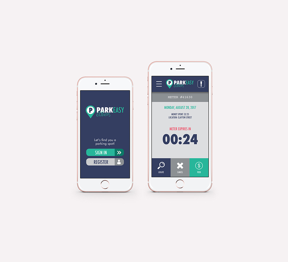
ParkEasy Athens is an app prototype (built in MarvelApp), website (using WordPress), and brand (using Adobe Creative Suite) created as part of a capstone project for my Masters of Emerging Media degree at the University of Georgia. Click the image below to visit the ParkEasy Athens website, or, keep scrolling to learn more about my design/ux process.
ParkEasy Athens is innovative, designed for the user, and the future of smart parking technology. Not only does ParkEasy Athens provide digital cash-less payment abilities, but it also offers other parking management features for the user in addition to features for municipalities that can simply their processes and reduce operating costs.
 For parking operations such as ITS and other meter companies, smart parking technology isn’t necessarily about driving up productivity and service in operations though, but rather providing long term value to customers (municipalities) that in turn will learn to expect more and therefore will be willing to pay more for products/apps that make their life easier. LEARN MORE
With the current frustration of parking in downtown Athens and the lack of an app anything like it, ParkEasy Athens solves problems and makes parking and efficient and an enjoyable experience for its users. With features such as the ability to find vacant parking spaces, as well as the ability refill your parking meter remotely, ParkEasy Athens brings downtown Athens goer’s parking dreams a reality.
|
My Process:
When developing the idea, I was given the challenge of solving a current problem using an Emerging Media solution. If you’ve ever been to Athens, GA, you KNOW parking is an issue. So, I knew from the very first class in my program that THIS was going to be my capstone project. In the beginning though, the name was “Parking Wizard.” However, after running through the first phase of the UX research process and surveying potential app users, it was determined that “ParkEasy Athens” resonated more with users.
Another change that occurred during the UX research process was the primary colors of the app. I knew I wanted to incorporated a share of blue as blue conveys calmness, but I wasn’t quite sure where to go from there. Originally, the apps colors were blue, orange, and green. However, after many iterations, the colors evolved to more of a serene, calming, and modern palette hoping that the users would identify more with a stress-free styled, modern, trendy branded app.
Here are a few snaps of the original version of the app:


